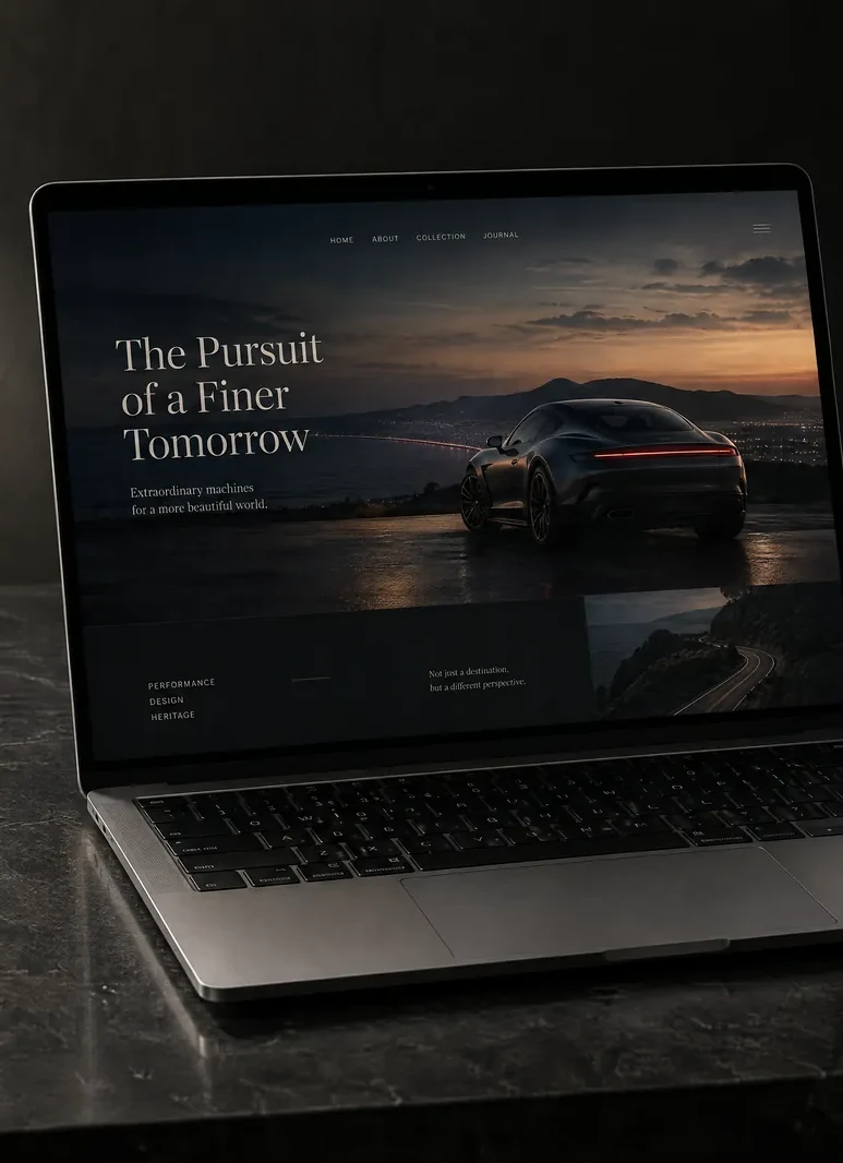


A website feels premium when everything on it looks deliberate: one or two fonts used consistently, plenty of space, real photographs, specific words, and pages that load quickly and stay still. It feels cheap when lots of small things are slightly off — a stretched photo, a third font, a pop-up in the first second, a copyright year that's out of date. Visitors rarely spot any one of these on its own, but together they become a feeling, and that feeling shapes whether they trust you.
Premium is mostly restraint
The sites that feel expensive usually have less on them, not more. They choose one or two typefaces and stick to them. They use a short list of colours, with one accent colour saved for the thing they most want you to do. They leave space around headings and images so each idea has room to land.
Sites that feel cheaper tend to keep adding. A different font for the quotes, a new button style on the contact page, a gradient here, a drop shadow there, an icon beside every heading. None of it is wrong on its own. Together it reads as a site that was assembled rather than designed.
Try this on your own homepage. Count the fonts, the button styles and the colours. If any of those numbers surprises you, that's the place to start.
Real photos beat polished stock
Stock photography is the quickest way to look like everyone else. The handshake, the team gathered round a laptop, the smiling receptionist in a headset — visitors have seen them on countless other sites, and they quietly discount whatever sits next to them.
Your own photos don't need to be glossy. They need to be sharp, well lit and consistent. Shoot in similar light, keep the colour feel the same across the set, and crop with care. A plain, honest photo of your actual workshop, van or shop counter says more than a beautiful picture of somebody else's.
Watch for the technical cheapeners too:
- photos stretched or squashed out of their natural shape
- blurry or pixelated images, usually saved too small and then scaled up
- the same image reused on page after page
- a logo sitting in a white box on a coloured background
Words do half the work
Premium sites say specific things in short sentences. Compare "Welcome to our website" with "Handmade oak furniture, built to order in our Lincolnshire workshop." The first could belong to anyone. The second tells a visitor what you do, how and where, in a single line.
The phrases that cheapen a site are the ones every competitor uses: "passionate about what we do", "quality service at affordable prices", "your one-stop shop". They take up space without telling anyone anything. So do long blocks of unbroken text, rows of exclamation marks, whole sentences in capitals and spelling mistakes. One typo in a homepage headline can undo a lot of careful design.
A simple rule: if a sentence would still be true on a rival's website, rewrite it until it's only true of yours.
The details nobody mentions, but everybody notices
These are small, quick to fix and easy to overlook:
- an email address on your own domain, rather than a free webmail account
- a browser tab icon (a favicon) that's your mark, not a platform's default
- a copyright year that's current, or no year at all
- a 404 page that helps people find their way back, rather than a bare error
- forms that say clearly what happens after someone presses send
- links that all work, and no leftover placeholder text
- buttons that respond when you hover over or tap them
- phone numbers you can tap to call on a mobile
- social icons only for accounts you actually keep up to date
A social feed showing a post from two years ago, or a "latest news" section with nothing new in it, tells visitors more than you'd like. If you can't keep something current, leave it off.
Fast, still and easy on a phone
Slow feels cheap, however good the design. So does a page that jumps about while it loads, so the button you were about to tap slides out from under your thumb. Both are measurable, and both usually come from oversized images, too many add-ons and scripts, or things loading late and pushing the content down.
Interruptions cheapen a site too. A pop-up before someone has read a sentence, a chat window that opens by itself, video that plays with sound, a cookie banner that covers half the screen. Each one tells the visitor the site cares more about itself than about them.
Then look at the whole thing on a phone, because that's where many people will meet it first. Check that:
- text is readable without zooming
- buttons are big enough for a thumb, with space between them
- nothing scrolls sideways
- the menu opens and closes cleanly
- photos are cropped sensibly at the narrower width
A site that looks premium on a large screen and awkward on a phone isn't premium.
Where we come in
We design and build every site in our own code rather than starting from a template, so each of these details is a decision we make on purpose. If you'd like a website that feels considered from the first scroll, see how we approach web design.